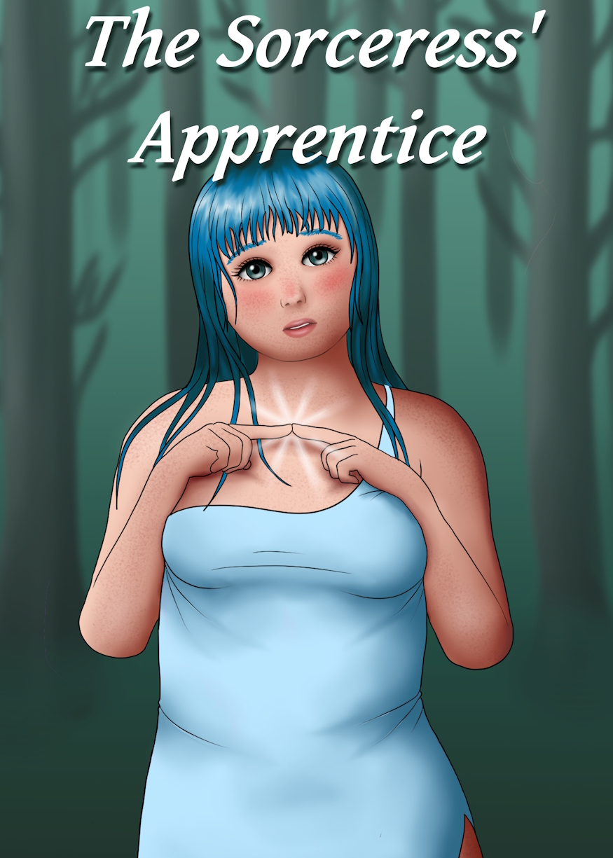
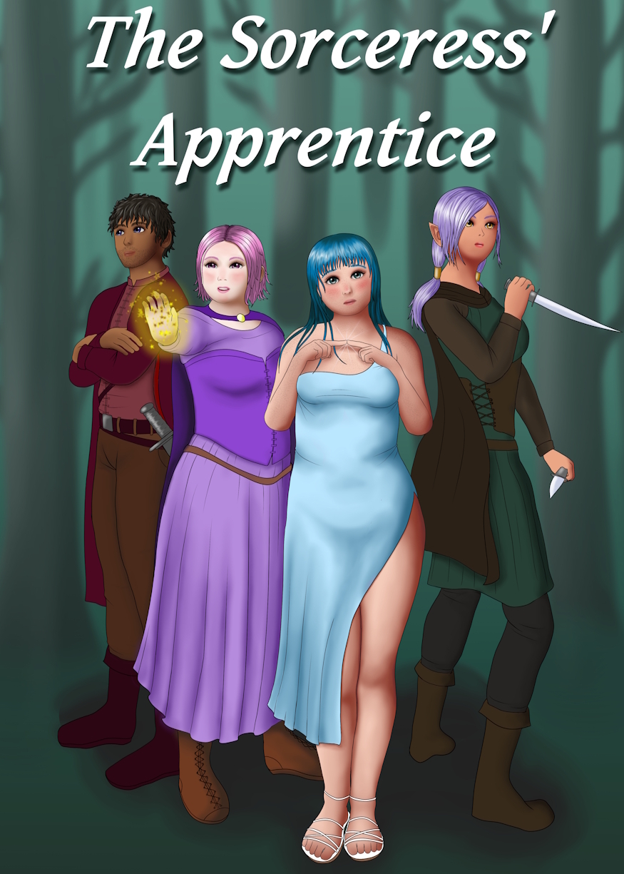
I'm not very fond of either.

I mean, it's cool to be able to draw consistently, but I just don't personally dig the art style, and I wouldn't click on it.
I have my own hypothesis on topics like this. People nowadays are going crazy because of "AI Art on Covers", not realizing that there are really great artists who draw similarly to your average AI cover Art. Why do I mention this? Because I believe the actual oversaturation happened on the Webnovel market due to the growing popularity of Webtoons YEARS ago, before AI Art was even a thing.
While Lightnovels always did something similar, they were always niche, and nobody cared that much, whereas Webnovels from the Korean market were far more accessible and popular. Still, Webtoons have a huge audience, while Webnovels remain niche in comparison, even to this very day. Since Webnovels that spawned Webtoon adaptations are more likely to be read, a lot of other Webnovels went ahead and used "Webtoon-esque" Art on their covers, which implied more than they actually were, to draw in readers (that's as much as I could gauge; in other words, it's a theory).
I do understand putting people on book covers, I use them too, but I don't often show people's faces (I do make exceptions, obviously, but compared to how many covers I have made in my lifetime - which is a lot - it's very few with full-on faces on them and people being clearly recognizable). Because you want to imagine the characters yourself, if it's not a medium that shows you the characters in the first place.
Outside of that, it doesn't tell you anything anyway; you could put a bunch of squares on your cover, and it would give me the same amount of input on the story as your quartet of characters does. It's just padding, nothing more. If it's padding, it needs to appeal to as many eyes as possible, whereas a specific drawing style that doesn't necessarily cater to the general mass will not be appealing to the average potential audience.
I'm sure there will be people fast at telling me that I'm wrong, because it's up to taste, but I'm basing this on estimations and observations I have made over the years. Every site has its audience pool, and you might go well with just putting a woman with cleavage on the cover. Sometimes, there doesn't even have to be a cover to draw in an audience. But those aren't the ones you are targeting with your cover anyway. You are targeting those who go by first glance appeal without looking solely for boobage.
I never understood why a Webnovel, that isn't a Webtoon, would desperately need a Character drawn on the cover. If your art style is very cool and very likely to appeal to many people, AND you drew something that carries weight, something that carries a bit of personality with it, I would totally say go for it. But in this case, the drawing doesn't even properly blend in with the background, and then the font just hovers above their heads like the Sword of Damocles. It's all very messy, yet boring, since it tells me nothing the Title didn't already hint at.
The text is also stuck to the ceiling (where typography on any sort of poster or cover should never stick, because it leaves the field of vision to the viewer - though that rule ESPECIALLY goes for the bottom).
Aaaanyway, that's my five cents.